10 ’80s Color Combinations Pinterest Says Are Officially Cool Again in 2026
Retro design in the 1980s was all about bold confidence. Purple, teal, hot pink, and mint defined the decade of high-energy interiors. Today, these classic shades are making a modern, sophisticated comeback. The Pinterest 2026 Palette features colors like Jade and Plum Noir. These updated colors are bringing back nostalgia. Keep reading to learn how to combine them in your home.
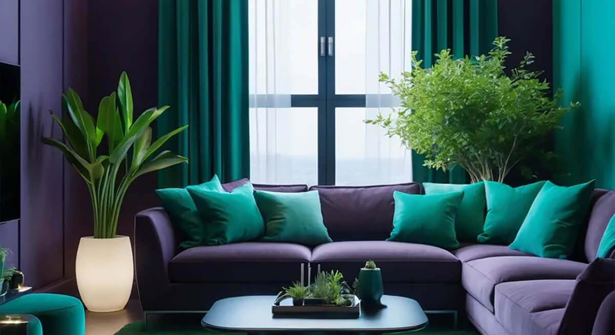
Plum Noir And Cool Blue
Credit: Trends Oraa
A deep purple wall sounds dramatic until pale blue joins the mix. This combination instantly softens the look. Pinterest also features Plum Noir and Cool Blue in its 2026 trends. Try a plum reading chair or a painted dresser against blue trim and sheets. It helps build a mature, inviting space.
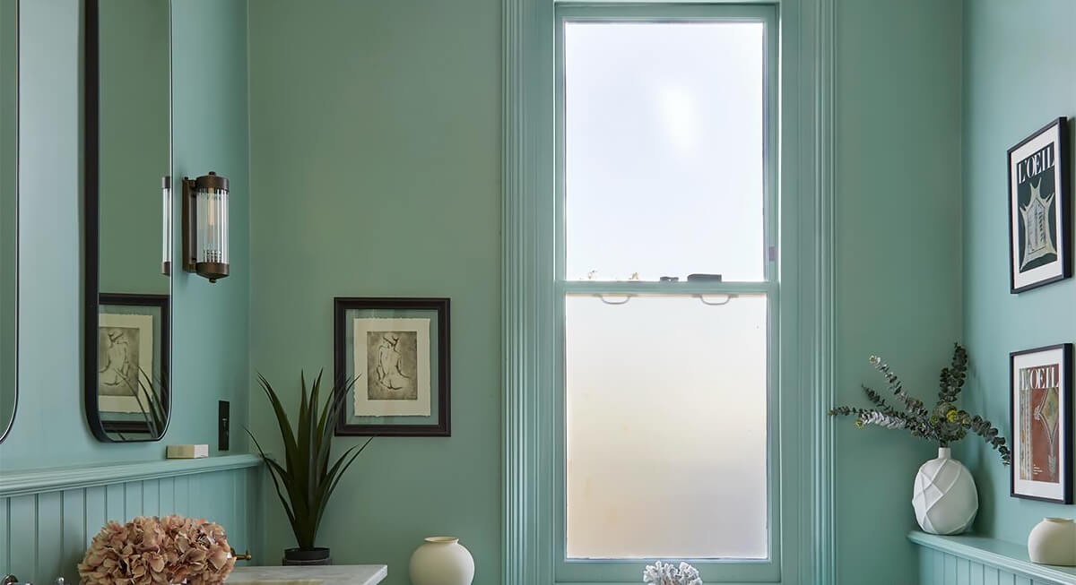
Jade And Cream
Credit: Instagram
Jade is the grown-up cousin of the green tones that were once popular in kitchens and bathrooms. Pairing it with cream creates a soothing atmosphere. You could install a jade vanity or lower cabinetry and use cream tiles to balance the look. Mint accents also help keep the space feeling bright and modern. Adding brass hardware or wooden shelving provides warmth and keeps the design from feeling cluttered.
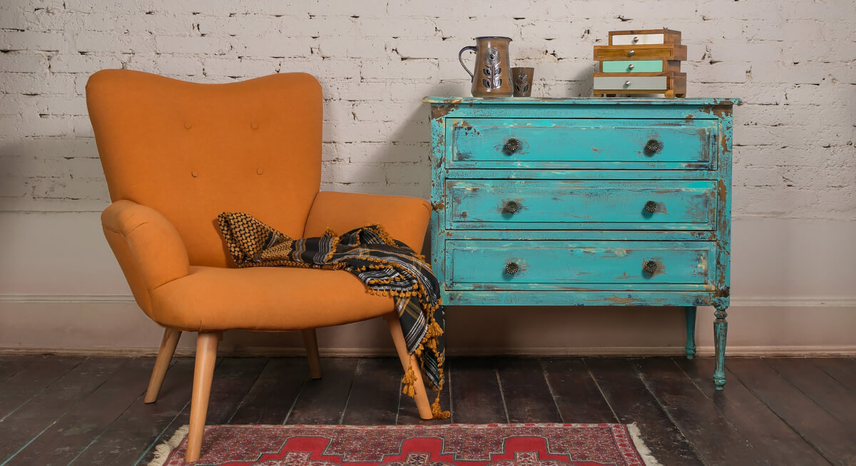
Persimmon And Turquoise
Credit: Canva
Persimmon offers a bold red-orange look popular for 2026, while turquoise adds a bright vintage feel. A turquoise cabinet paired with persimmon artwork looks lively without overwhelming the entire area. Keeping walls white provides a clean backdrop. A jute rug would keep the style relaxed, which is helpful when using such expressive and lively indoor tones.
Wasabi And Charcoal
Credit: Instagram
Wasabi packs a punch. Since this shade leans toward electric yellow-green, charcoal provides a necessary balance. A single wasabi lamp in a dark office does more than a whole painted wall. This palette works well for anyone seeking a bold but practical look. Stick with matte finishes because gloss risks making the green look like a cheap novelty.
Mint And Dusty Rose
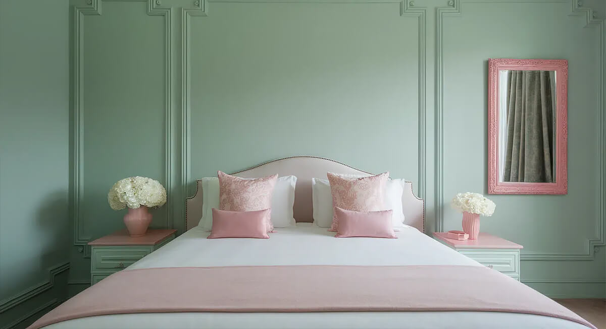
Credit: Opple House
A bedroom with mint and dusty rose accents offers a glimpse into the classic 1980s style. The mint creates a fresh, bright feel, while the rose provides warmth. Try placing rose sheets against mint walls and using light-colored furniture. These soft tones make a room look charming without needing any bold or loud decorations.
Teal And Warm Plaster
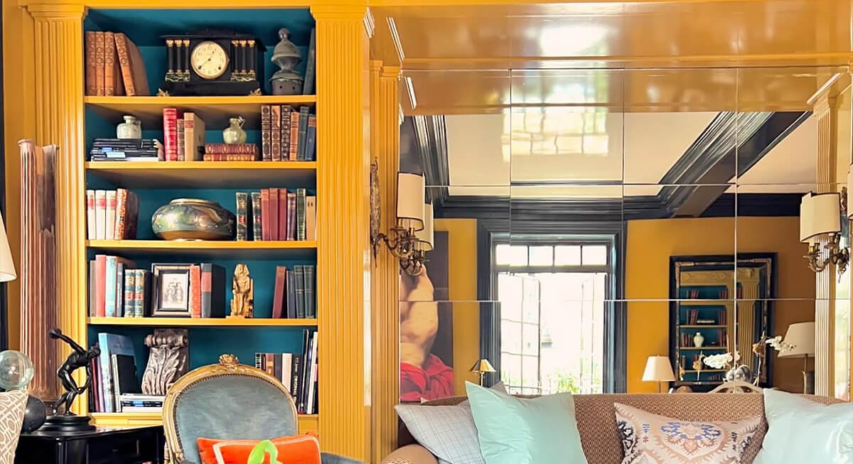
Credit: Instagram
Teal works best when given a specific role. Using it inside bookshelves adds a bold touch to a room. This deep shade pairs well with warm plaster walls to create a soft atmosphere. A den with teal shelving and terracotta-pink walls is classic yet functional. You can complete the look with your favorite books, art pieces, and soft lighting for a polished finish.
Hot Pink And Espresso
Credit: Instagram
Hot pink retains the playful energy of 1980s maximalism. Espresso brown provides a grounded, practical balance to the vibrant hue. A home office works well with pink wallpaper paired against a dark wood desk. Experts suggest using pink intentionally rather than covering every wall.
Lilac And Chrome
Credit: Getty Images
Lilac is a soft shade. Chrome adds a sharp contrast. Imagine a lilac stool and a shiny mirror against clean white walls in a bathroom. That metallic touch references the sleek styles in 1980s design. Adding cotton towels and matte tiles prevents the space from appearing too glossy. The real benefit is the impact a single chrome piece can have on a room’s design.
Peach And Electric Blue
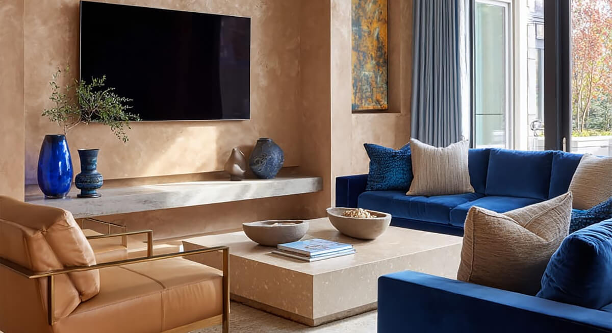
Credit: Harmony Home Design
Peach adds warmth to a space while a bold blue provides a bold contrast. This duo thrives in living rooms where peach tones fill the walls and blue accents appear on furniture or lamps. The electric blue should act as a sharp highlight rather than the primary focus. Adding cream furniture helps balance the two colors and keeps the design looking up-to-date in 2026.
Burgundy And Black, and White
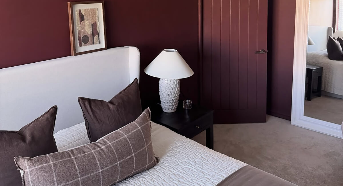
Credit: Instagram
Black-and-white patterns were a strong 1980s-style move, and they still work with bold modern shades, even if burgundy is not part of Pinterest’s 2026 Palette. A burgundy sofa placed on a graphic rug can define a dining nook or lounge area without needing extra decor. Neutral walls allow the furniture to stand out. This color scheme provides plenty of drama while remaining simple and balanced for any living space.