Weirdest Iron Man Armors That Are Too Ugly for the MCU
Tony Stark has built dozens of suits across decades of comic book storytelling, and not all of them aged well. Some designs might’ve made sense for a one-off issue or 1980s color palette, but they’d fall flat in a Marvel Studios movie. These armors leave audiences squinting in confusion, or worse, laughing in theaters.
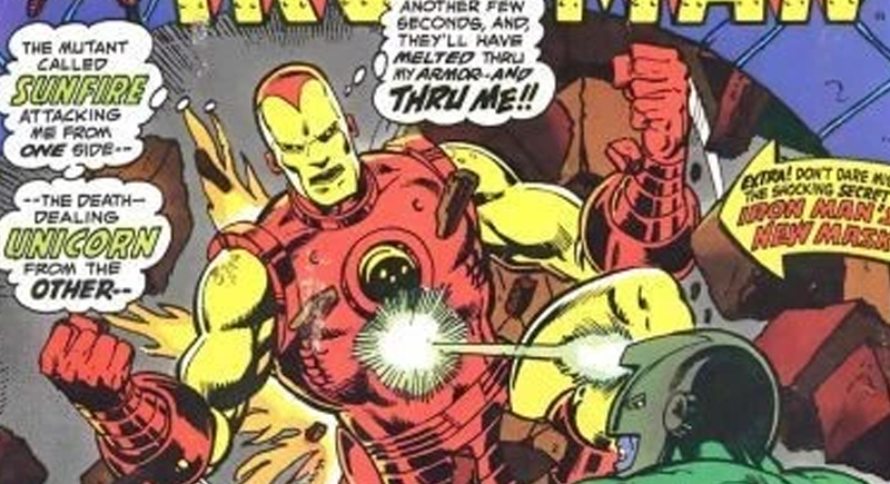
Nose Armor Looked Like a Bad Halloween Mask
Credit: eBay
In 1974’s Iron Man #68, Marvel added a nose to the helmet because someone thought it looked too flat. The result was precisely what you’d expect: bizarre and unnecessary. The change baffled fans and disappeared quickly, but not before it etched itself into Iron Man’s visual history as a strange experiment.
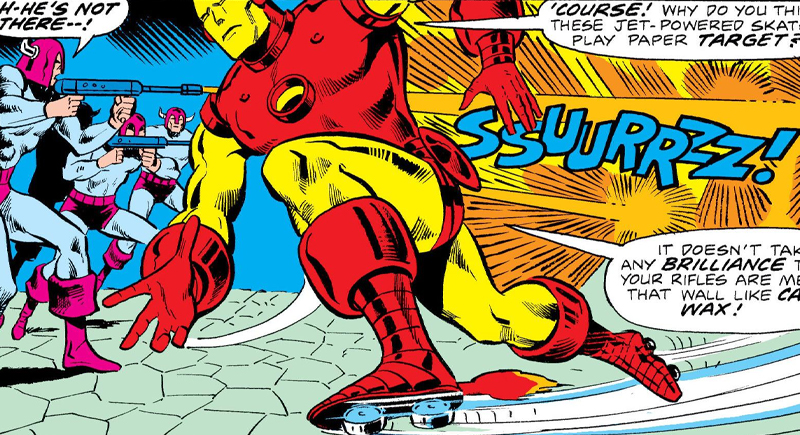
Roller Skates Made Things Worse
Credit: Reddit
In the early comics, Stark’s armor had built-in roller skates. Tales of Suspense #45 gave readers a version of Iron Man zooming through streets like a clunky disco robot. The skates were meant to save energy or aid in ground mobility, but the idea transformed a high-tech icon into a roller derby participant.
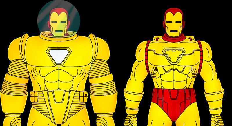
Iron Man 2020 Aged Like Spoiled Milk
Credit: Wikimedia Commons
Arno Stark’s Iron Man 2020 armor debuted in 1984’s Machine Man #2 with giant gold gears on the shoulders and a steampunk flair. It was Marvel’s prediction of what future tech might look like, and the result was a gaudy, overstuffed design that already looked dated by the 1990s.
Hydro Armor Looked Like a Power Rangers Reject
Credit: Reddit
Iron Man #218 sent Tony underwater with the Hydro Armor. Sure, it helped him survive deep-sea pressure, but its bulky form and sharp blue fins screamed “toyline exclusive.” With a bug-eyed helmet and a heavy silhouette, it lacked the design language that made his movie suits feel modern.
Gold Armor Was Just Too Much Shine

Credit: Reddit
Iron Man’s full-gold armor appeared in Tales of Suspense #40, trying to rebrand him as less intimidating. Instead, he looked like a walking trophy. The blinding finish and plain design lacked detail, and the armor came off more like spray-painted metal than superhero innovation.
Thorbuster Tried Way Too Hard

Credit: Reddit
Iron Man Vol. 3 #64 featured the Thorbuster, a crystal-powered suit built to counter Thor. It sounded epic, but looked like Stark borrowed armor from a fantasy RPG. The runes and glowing plates gave it a weirdly magical appearance. Though it’s rooted in an intense storyline, this design wouldn’t fit the MCU’s established tone.
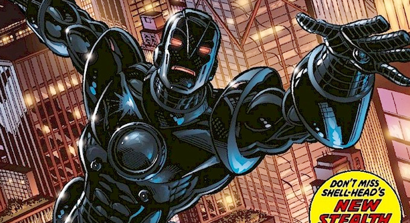
Stealth Armor Was All Style, No Spark
Credit: Reddit
Tony’s first Stealth Armor appeared in Iron Man #152 and ditched the flash for matte-black tech. The problem was that it sacrificed too much personality and ended up looking generic. The minimalist design worked for Cold War espionage comics, but it wouldn’t translate to the theater.
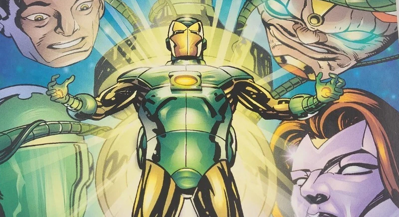
Iron Lantern Couldn’t Decide What It Was
Credit: eBay
The 1997 Amalgam Comics mash-up turned Iron Man into Iron Lantern—a fusion of Tony Stark and DC’s Green Lantern. It had glowing constructs and armored plating, but the combo seemed directionless. The Lantern ring clashed with the tech vibe, and the design overwhelmed the core character with cosmic noise.
Arctic Armor Looked Like a Fancy Thermos
Credit: Reddit
In Iron Man #318, Tony Stark built a suit specifically designed for use in freezing climates. The Arctic Armor had insulation and thermal gear. But it raised eyebrows, because why would Iron Man need an entirely new suit when later versions already handled extreme temperatures? The logic didn’t hold up, and the visual didn’t wow.
Space Armor MK III Had No Restraint
Credit: Reddit
Iron Man Vol. 5 #5 introduced the Space Armor MK III, essentially a rocket-powered space RV built for deep-space travel. It packed every system imaginable—oxygen recyclers, long-range sensors, interstellar thrusters. It looked cluttered, oversized, and awkward. On paper, it was genius. On screen, it’d swallow Stark whole.