The Real Reason Avocado Green Kitchens Defined the ’70s (And Why They’re Coming Back)
Avocado green didn’t appear in homes by accident. By the late 1960s and early 1970s, attention had moved toward the environment. Concerns about pollution, conservation, and resource use were growing, and this mindset began to be reflected in design. Earthy tones like avocado green, mustard yellow, and burnt orange became popular because they felt grounded and connected to nature.
Color historian Patrick Baty links this to changing materials and manufacturing. After World War II, new materials like plastic, PVC, and laminates made it easier and cheaper to produce household items in a wide range of colors. By the time the 1970s arrived, manufacturers had both the tools and the audience ready for something different.
Thus, avocado green was a perfect fit. It wasn’t bright like the 1960s colors, but felt warmer, softer, and more “natural,” which matched the mood of the time.
The Psychology Behind the Color Choice
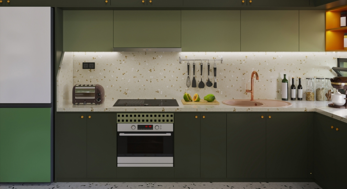
Image via Canva/CGI STUDIO
People don’t pick colors as randomly as they think. Color psychologist Karen Haller points out that only about 20 percent of color decisions are made consciously. The rest comes down to emotion.
In the 1970s, green became a shortcut for nature. It suggested balance, growth, and a connection to the outdoors. That made it an easy choice for kitchens, which were starting to move into more social, lived-in spaces.
At the same time, homes were becoming more personal. The bold experimentation of the 1960s had opened the door for people to express identity through design. Avocado green was a signal that the home reflected the owner’s values and outlook. That’s why it spread so fast. It showed up on refrigerators, ovens, sinks, tiles, and even carpets. Once it took hold, it defined the decade’s look.
How It Became the Most Mocked Color in Design

Image via Pexels/Gustavo Fring
By the 1990s and early 2000s, avocado green had lost its appeal, and interior design moved toward minimalism. Neutral tones like beige, gray, and cream became the standard. Homes were increasingly treated as financial assets, which meant safe, widely acceptable color choices took priority.
Avocado green, along with other 1970s shades, started to feel heavy and outdated. Entire kitchens covered in green appliances and tiles became a punchline. The reaction was strong enough that many homeowners replaced or covered anything that hinted at that era.
Why Avocado Green Is Back in 2025
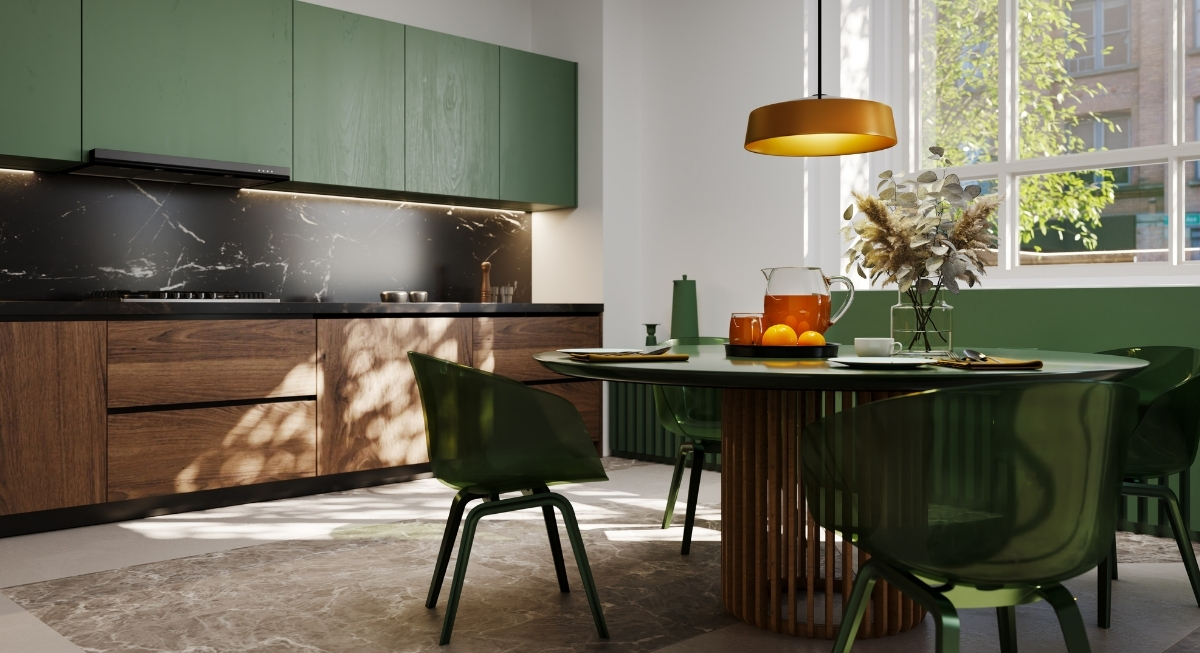
Image via Getty Images/piranka
After years of gray-heavy interiors and clean, minimal spaces, people started craving warmth and personality in 2025. Homes needed to feel comfortable, not just polished. That opened the door for richer, more expressive colors.
At the same time, interest in sustainability and secondhand shopping grew. Vintage furniture and decor, often featuring 1970s colors, returned to circulation. There’s also a generational factor. Younger homeowners who didn’t grow up with avocado green see it as fresh and interesting, not dated.
The Modern Take Looks Very Different
In the 1970s, avocado green covered entire rooms, but in 2025, it’s added in a more subtle way. Designers often pair it with neutral walls, such as warm white or soft beige, then add green through cabinets, furniture, or statement pieces. The heavy patterns and layered textures of the past have been replaced with simpler shapes and natural materials. This makes the color feel intentional instead of overwhelming.