The Marketing Campaign That Made “Santa Claus” Red
Few holiday images feel as familiar as the man in the bright suit who slips into chimneys every December. The version most people picture now fills store shelves, parade floats, and winter ads, yet it did not start out that way. The red suit took shape through a mix of older traditions, clever marketing, and the cultural moment that tied it all together.
Before that shift, Santa appeared in all sorts of outfits and body types. Some artists drew him tall and lean. Others turned him into a small, elf-like figure. Illustrations placed him in tan coats, bishop robes, or heavy fur that made him look more like a traveler than a gift-giver. The story was familiar, but his appearance changed with each artist, decade, or publication.
The early twentieth century arrived with new printing styles, national magazines, and a growing advertising industry, and that period created the perfect opening for a single look to take hold.
Early Holiday Ads Set the Foundation
Civil War illustrator Thomas Nast drew Santa Claus throughout the late nineteenth century, gradually shifting his image toward red, but the depiction still varied. Coca-Cola then produced Christmas advertising in the 1920s, placing shopping-season ads in major magazines.
Those early versions showed a strict style of Santa that followed the old Nast drawings. He came across as firm and watchful rather than soft and round. These ads introduced the company to holiday marketing, but the imagery did not yet resemble the figure that fills our modern gift bags.
A step forward came in 1930 when Fred Mizen created artwork featuring a department-store Santa enjoying a bottle of Coke at the largest soda fountain in the country. That image appeared in The Saturday Evening Post and garnered attention because it paired a familiar holiday figure with a drink often linked to warmer months. Still, this Santa had not reached the form that would eventually dominate American pop culture.
The 1931 Breakthrough

Image via Canva/Africa images
In 1931, Coca-Cola expanded its winter campaign and aimed for something more inviting. Agency executive Archie Lee encouraged the company to use a Santa who came across as human and warm. This direction moved away from stiff costumes and into full character design. It required someone who could merge folklore with a friendly presence that matched the mood of the season.
Michigan illustrator Haddon Sundblom took on the assignment. He used Clement Clark Moore’s 1822 poem about St. Nicholas as inspiration, studying its descriptions of a plump, lively figure. This gave him a road map for a version of Santa who carried personality and charm.
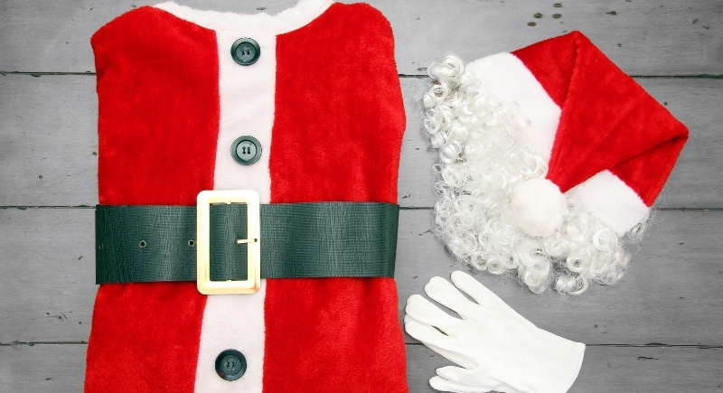
His new artwork featured a round-bodied man with a kind expression, red suit, and white beard, and he placed him in scenes that felt like snapshots of holiday nights around the country.
Sundblom’s illustrations appeared in major magazines beginning in 1931. Readers saw Santa reaching into refrigerators, reading letters, delivering toys, talking with children, and taking breaks with a bottle of Coke. This version spread quickly because it was consistent, accessible, and printed everywhere people turned that season. Over time, it became the image people expected during the holidays.
The campaign continued until 1964, giving the design more than three decades of visibility. Store displays, calendars, posters, and billboards used Sundblom’s work across the country and later across the world. The paintings grew into collector favorites, and many originals now appear in museum exhibitions and Coca-Cola’s archives. Each reused piece of art strengthened the public’s connection to this form of Santa.
Real People Behind the Image
Sundblom began the project using Lou Prentiss, a retired salesman, as his model. Prentiss provided the posture and facial structure that shaped the early paintings. When Prentiss passed away, Sundblom used his own reflection for reference and later built details through photographs. His dedication ensured Santa stayed consistent across future ads.
Children who appeared in the paintings came from Sundblom’s neighborhood. He originally painted two girls he knew, then altered one to look like a boy to fit the composition. A poodle owned by a local florist also made a 1964 cameo and was painted black to stand out in the scene. These small details added personality to Santa’s world and helped viewers picture him as a visitor in real homes.
Coca-Cola expanded its cast in 1942 with Sprite Boy, a small elf-like character who showed up beside Santa throughout the 1940s and 1950s. Sprite Boy supported the brand’s winter message but had no connection to the later lemon-lime soft drink, which arrived more than a decade afterward. His presence added another element to the holiday visuals that the company released each year.
Though Sprite Boy eventually faded out, the central Santa remained. By the time television grew into a major advertising medium, the image had already secured its place. Coke had built a seasonal identity strong enough to carry over into new formats without rewriting the entire look.
How Santa’s Red Suit Became a Standard

Image via Getty Images/HannamariaH
Sundblom did not invent Santa out of thin air. Earlier depictions had included red coats, though not with the same consistency. What changed in the 1930s was the scale of distribution. Millions of Americans saw the same image across magazines, store displays, and holiday promotions. The repetition locked in a specific design featuring a red suit, soft beard, round stature, and friendly expression.
Over time, this version spread far beyond the United States. Coke’s international reach introduced the image to countries with their own holiday traditions. In many places, the red-suited figure became the default simply because he appeared in advertising tied to one of the world’s largest brands.
The success of the campaign solved Coca-Cola’s winter sales challenge and created one of the most recognizable images in modern culture. Santa in a red suit became a fixture during the shopping season, and Coca-Cola wove itself into that annual rhythm. Today, holiday packaging, themed trucks, and seasonal promotions still draw on elements established nearly a century ago.
The broader world of marketing took note of how consistent visuals can define and turn a product into a piece of cultural tradition.