10 Oldest Mascots in the World (Some Used to Be Way Creepier)
Mascots like Bibendum and Elsie the Cow weren’t designed with decades of shelf life in mind, but that’s exactly what happened. Some of these characters debuted before World War II and still appear on packaging today, while a few began with unsettling designs that were toned down over time.
Their main job was to create instant recognition for a brand, and in several cases, they became more recognizable than the products themselves. Here are some such mascots that represented and defined the companies that made them.
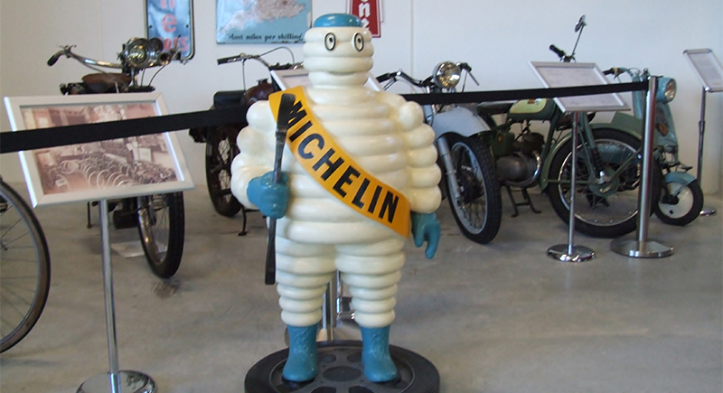
Michelin Man, 1898
Credit: Wikipedia Commons
Tires stacked like a man’s body inspired one of the most enduring figures in global advertising. Bibendum, better known as the Michelin Man, first showed up in a poster holding a drink filled with nails. He symbolized how Michelin tires could “drink up” road hazards. Gradually, designers softened his eerie look.
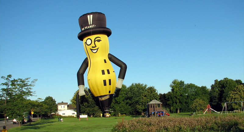
Mr. Peanut, 1916
Credit: Wikipedia Commons
A cane, a top hat, a monocle. Mr. Peanut has worn the same outfit for more than a century. Planters never tried to make him goofy or over-the-top. Instead, they stuck with this crisp, old-fashioned look. Even as other mascots changed, Mr. Peanut stayed the same—always polished, always the face of Planters on every can and commercial.
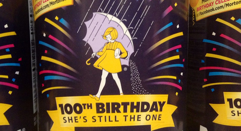
Morton Salt Girl, 1914
Credit: flickr
She walks through the rain with an umbrella, salt spilling behind her. The image told shoppers everything: Morton’s salt pours, even in damp weather. Over time, the girl became a fixture on kitchen shelves, still familiar even to people who’ve never heard the story behind her yellow dress and umbrella.
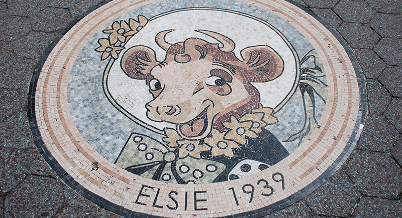
Elsie the Cow, 1936
Credit: Wikipedia Commons
Before spokespeople became common in food marketing, Elsie the Cow was a relatable voice for Borden Dairy. The company gave her a full personality. She even had fictional “family” members who were occasionally featured in campaigns across the radio and print ads.
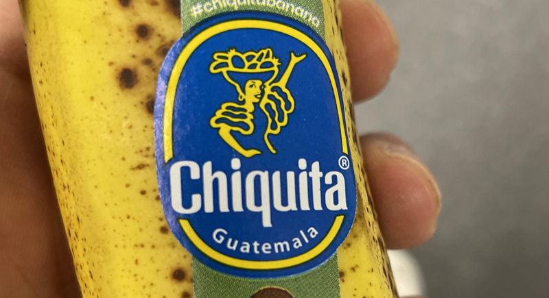
Miss Chiquita, 1944
Credit: Reddit
The earliest role assigned to Miss Chiquita was that of an instructor who taught people how to store and eat bananas. In the 1940s, they were still a novelty product for many Americans. Initially just a banana in heels, she transformed into a human woman by 1967. Illustrator Oscar Grillo’s updated version gave her a confident, modern look that helped her stay relevant.
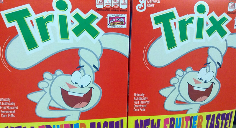
Trix Rabbit, 1957
Credit: flickr
Advertising for Trix cereal always focused on the same basic plot: A rabbit tries to eat cereal, and kids stop him with the famous line, “Silly rabbit, Trix are for kids.” The persona briefly tasted success as viewers saw the rabbit as persistent and relatable.
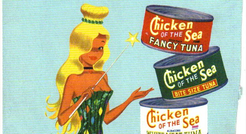
Chicken Of The Sea Mermaid, 1952
Credit: Reddit
Long before anyone cared about brand mascots having a backstory, the Chicken of the Sea mermaid appeared on tuna cans without explanation. She had no name and never spoke, yet her presence became inseparable from the product. In 2014, the brand held a contest to finally name her decades after her debut.
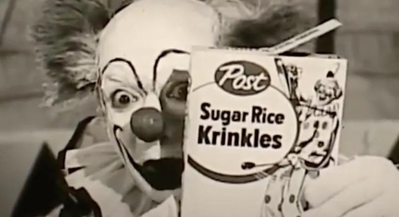
Krinkles the Clown, 1956
Credit: Reddit
Krinkles didn’t last long. In a single, jarring TV spot, he shuffled across the screen half-awake, pushing Sugar Rice Krispies with a dazed grin. The strange performance left kids and parents uneasy. The cereal faded soon after, but the memory of that offbeat clown stuck around far longer.
Snap, Crackle, and Pop, 1930s
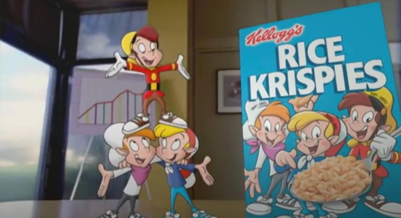
Credit: Reddit
Rice Krispies created a whole new world filled with cartoons, and Snap, Crackle, and Pop were the main characters. Each figure used to have exaggerated features and tiny bodies. Over the years, animators made them look more human, while still leaning into their mischievous energy.
Aflac Duck, 2000
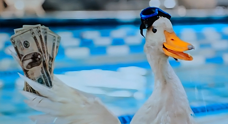
Credit: Reddit
A marketing team solved Aflac’s name recall problem by introducing a duck who simply shouted the company name. Voiced originally by Gilbert Gottfried, the duck starred in commercials where confused illustrations would mutter about insurance until he yelled “Aflac!” Surprisingly, the gimmick worked.
Jolly Green Giant, 1925
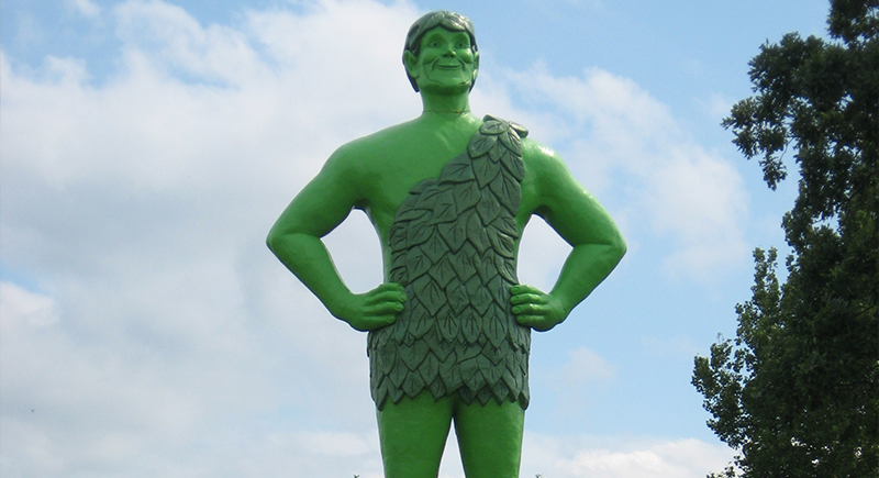
Credit: Wikipedia Commons
Oversized peas introduced in the 1920s needed a strong visual hook, so General Mills created a towering figure to represent them. Early versions looked like a stern guardian as opposed to a friendly mascot. That changed with a softer expression, brighter colors, and the now-familiar “Ho, ho, ho” jingle.
Pillsbury Doughboy, 1965
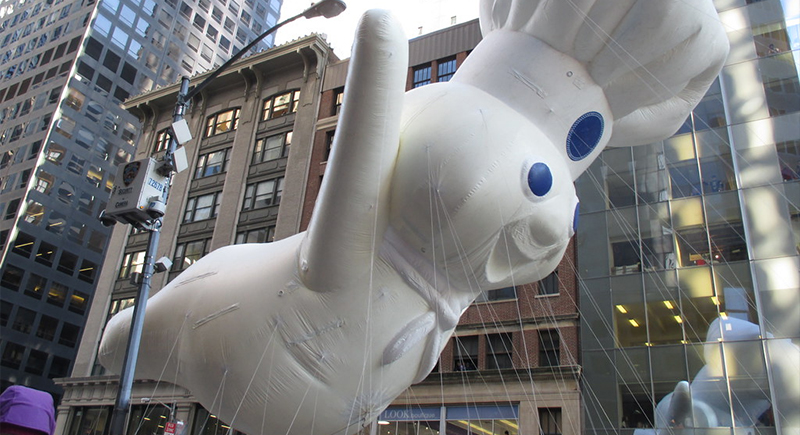
Credit: flickr
Poppin’ Fresh, better known as the Pillsbury Doughboy, was launched through stop-motion commercials that used a real model rather than drawings. His appeal came from his soft texture, his giggle, and his polite manner—each ad ended with someone poking his stomach. That simple interaction made him memorable.
Mr. Clean, 1958
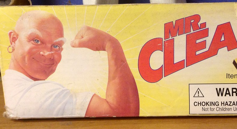
Credit: flickr
Household cleaning products once focused on ingredients and results, not characters. Procter & Gamble introduced Mr. Clean as a bold exception. The all-white outfit, bald head, and crossed arms gave him a strong, reassuring presence. His image eventually extended beyond household cleaners.
Ronald McDonald, 1963
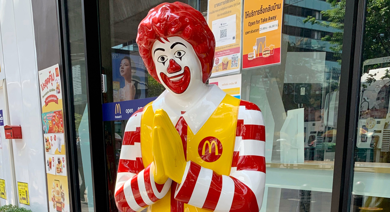
Credit: Wikipedia Commons
McDonald’s advertising needed a playful figure to appeal to children, so a local franchise came up with Ronald McDonald. Willard Scott, later known for his weather reports, played the original version wearing a cup for a nose and a tray of food on his head. As the chain expanded, the mascot got a professional redesign.
Smash Martians, 1973
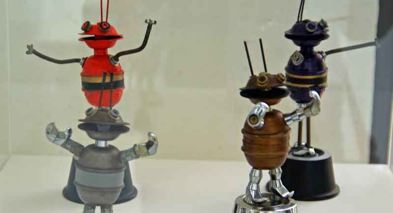
Credit: Wikipedia
Instant mashed potatoes rarely inspire strong impressions, but these metallic beings changed that. Created for Cadbury’s “Smash” instant potato brand, the Martians ridiculed people who peeled and boiled raw potatoes instead of using flakes. Their jerky movements and clunky designs gave them a low-budget sci-fi feel.