IKEA Stores Are Designed Like Mazes on Purpose
If you’ve ever been to IKEA, you know you’re not coming out with only what you went for. The store feels almost like a trap, and it’s hard to shake the sense that the layout is more deliberate than it looks. The Swedish retailer has been open about its strategy.
The maze-like layout is no accident. It is one of the most carefully engineered elements of the brand’s success, tested, adjusted, and even defended when shoppers begged to have it reinstated after a change. Far from being an architectural quirk, the IKEA maze is one of the most effective retail experiments in the modern shopping world.
A Walk-Through Catalog
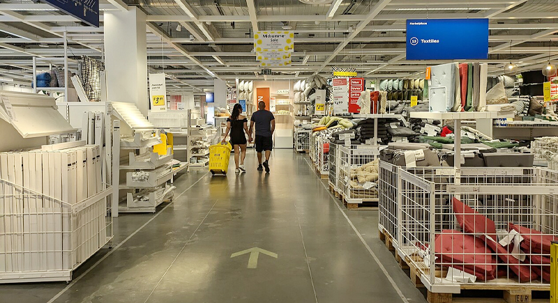
Image via Wikimedia Commons/Mx. Granger
The origin story goes back to Sweden in the mid-20th century. When IKEA opened one of its earliest flagship stores in 1965, the layout borrowed inspiration from the Guggenheim Museum in New York. Instead of traditional aisles, the store offered a looping path that encouraged people to wander through staged rooms.
Customers could walk through a living room, a kitchen, or a bedroom and imagine it as their own.
That decision became the blueprint for stores worldwide. Rather than leaving people to roam randomly, the company built a route that revealed products in sequence. It slowed shoppers down, exposed them to categories they didn’t plan to browse, and made every visit feel like a tour.
The Psychology of Getting Lost
Consumer behavior researchers explain that the layout is designed to increase both time and spending. Once you’ve made the trip to the store, you’re more likely to justify a purchase. For example, a bed isn’t just a bed. It’s displayed with sheets, pillows, lamps, and storage bins, so that one product becomes a dozen potential buys. The more time spent in this environment, the more likely a shopping list grows.
On a practical level, there are shortcuts built into every store for customers who truly want to bypass the maze. But surveys show many shoppers prefer the guided flow. When IKEA experimented with more open, department-style layouts in urban stores in cities like Madrid, Shanghai, and Warsaw, customers complained. They missed the guided experience.
Many even said they forgot to buy things they meant to pick up because they weren’t led past them. Within a few years, the company brought back a scaled-down version of the maze in those locations.
Tricks Beyond the Path
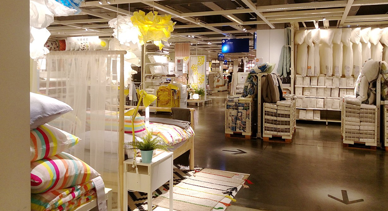
Image via Wikimedia Commons/Dquai
The maze is only one layer of IKEA’s behavioral design. Pricing is another. Items are often arranged in sets of three: a basic version, a mid-range version, and a premium version. The mid-priced product looks like the smart choice, and shoppers often pick it. Then there are the signs—“Limited Stock” or “Popular Item”—which tap into urgency. It’s a nudge to grab something now before it’s gone.
Even the cafeteria and kids’ play areas play a role. Cheap meals and safe spaces to park restless children extend the amount of time a family can spend inside. This keeps customers comfortable and makes the shopping trip feel less like a chore and more like a day out. Every minute longer in the store means another chance to pick up a lamp, a cutting board, or that plant you didn’t know you needed.
Why the Maze Stuck
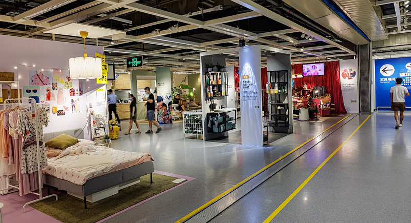
Image via Wikimedia Commons/Dinkun Chen
IKEA has more than 460 stores across 62 markets, many of them the size of several football fields. A traditional warehouse design could have made them feel overwhelming. Instead, the maze creates a sense of order and guides customers along a single path. The psychological trick is that people don’t want to leave without seeing what’s around the next corner. In the case of IKEA, getting lost was always the point.